State Department Reverts to Times New Roman: Embracing Tradition and Accessibility
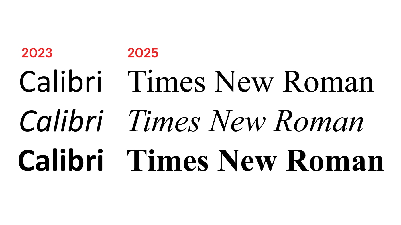
The State Department has decided to revert to using Times New Roman 14-point font for all official documents, replacing the Calibri font that was introduced in 2023. Secretary of State Marco Rubio issued a directive to diplomats worldwide to make this change, citing the need for consistent formatting to enhance credibility and maintain a unified department identity. The move away from Calibri, a sans serif font, was criticized for potentially reducing accessibility for readers with disabilities, as serif fonts like Times New Roman are considered easier to read, especially for individuals with dyslexia or low vision. The Americans with Disabilities Act mandates the use of sans-serif fonts for physical signage and display screens due to their legibility, while serif fonts are more commonly used in print media and formal documents. Times New Roman, a classic serif font, has a long history of being favored for its formal and professional appearance, despite the shift towards more modern fonts like Calibri in recent years. The decision to return to Times New Roman aligns with the Trump administration's emphasis on presenting a unified and professional voice in all communications, as part of its broader focus on aesthetics and traditional values. The move reflects a broader trend within the administration to prioritize classical and traditional styles in various aspects of government operations, including font choices and architectural designs.